FIGMA
Wireframing, Prototyping, LO, MID, HI-FI Mapping, UI components
User Zoom
Usability Test
MIRO
Brainstorming, mapping and team collaboration
TEAMS
Interviews, Team meetings
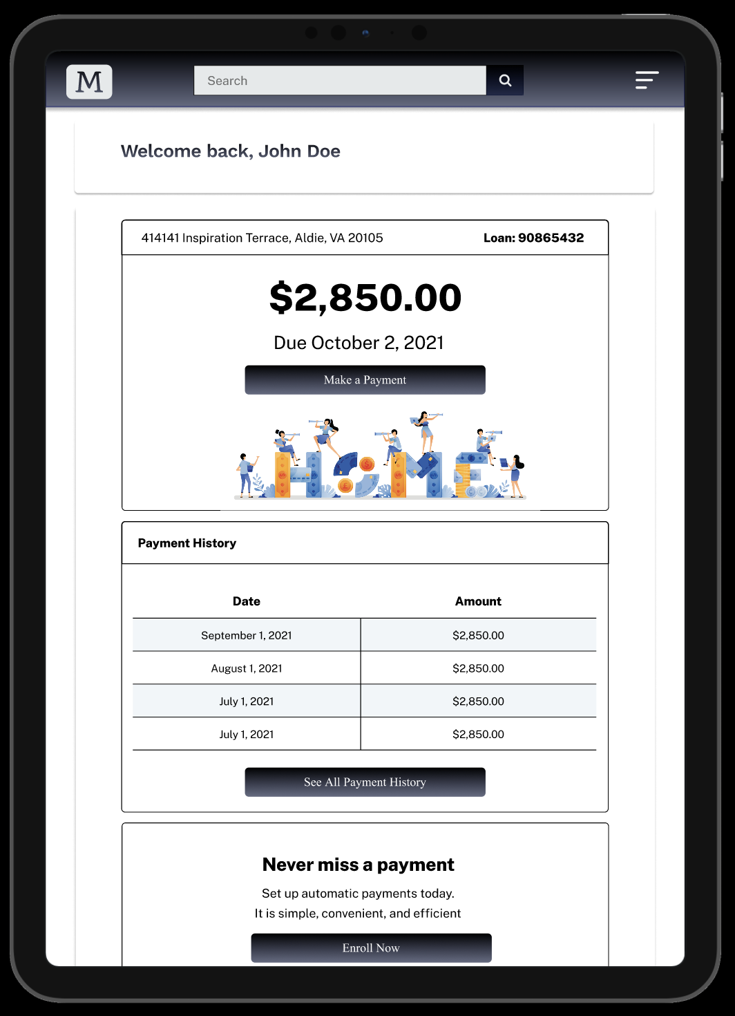
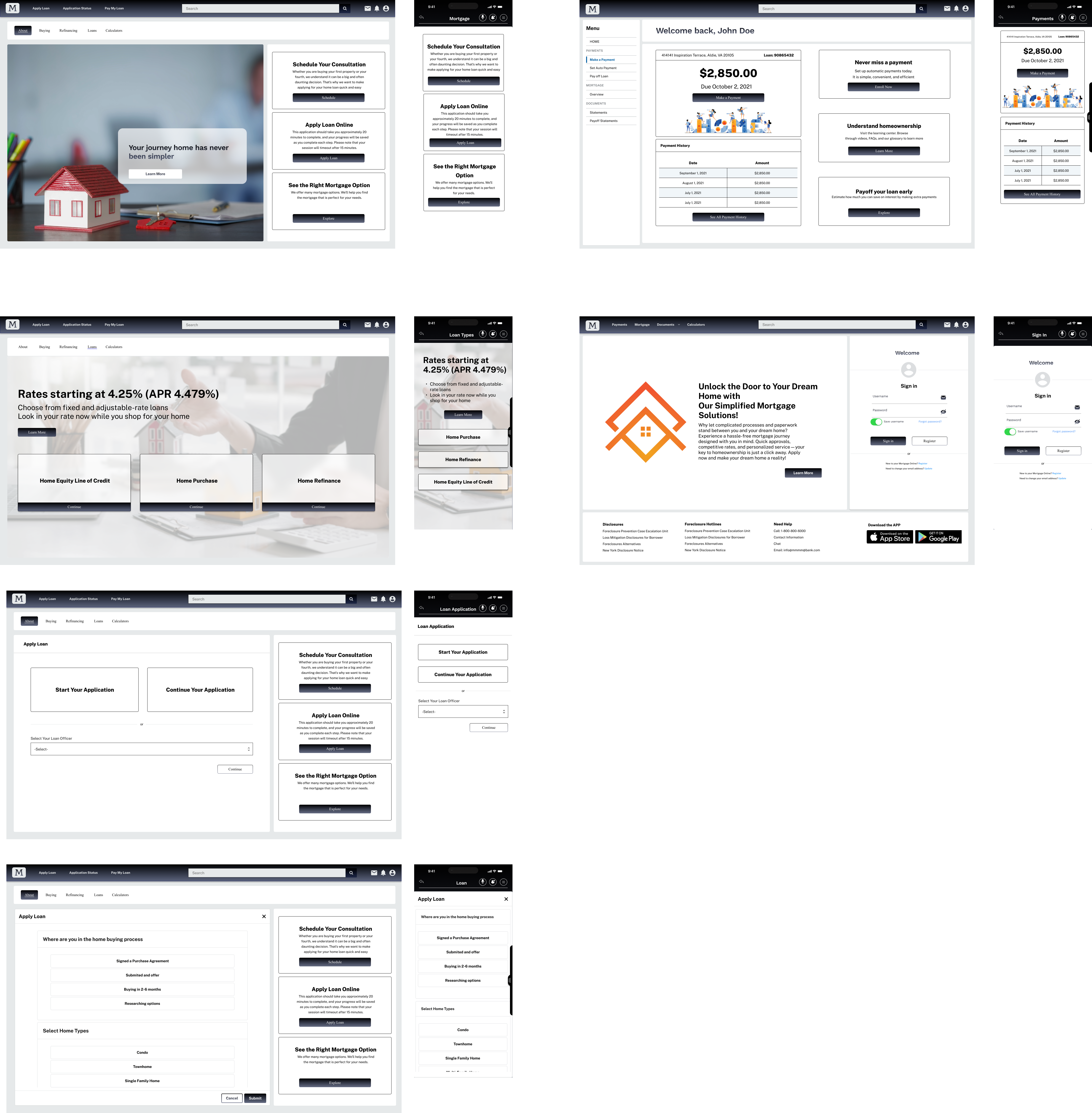
The mortgage process of a leading bank, focusing on creating an intuitive, efficient, and customer-friendly experience.

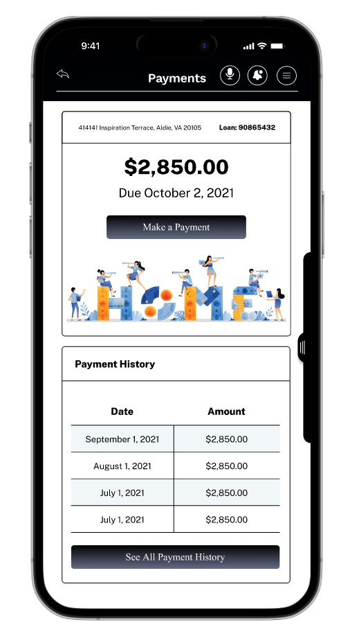
As the financial industry continues to evolve, there’s a growing need for user-centric, streamlined mortgage solutions. This case study highlights my experience as a UX/UI designer in reimagining the mortgage process of a leading bank, focusing on creating an intuitive, efficient, and customer-friendly experience.
Create Problem Statement, User Flow Map, Low-Fidelity Map, Wireframing
User Interface Design, UI Elements, Hi-Fidelity Map, Prototyping
Solve visual problems and make things look visually good
Prototype tests, First click tests, Design Surveys, Preference Tests, Five Seconds Test
Wireframing, Prototyping, LO, MID, HI-FI Mapping, UI components
Usability Test
Brainstorming, mapping and team collaboration
Interviews, Team meetings

The mortgage application process at the bank was cumbersome, time-consuming, and complex. Users reported high dissatisfaction with the application process, leading to poor conversion rates and a higher-than-average drop-off rate.


Empathize with users by speaking with them directly
User Interview
Identify and narrow users' pain points
Afiinity mapping
User Persona
User Journey
Conceptualize solution that solves user pain points and mapping all of them
Competitive analysis
Task Flow
User Flow
Create Lo, Mid and High Fidelity maps, wireframing, prototyping, usability testing
Wireframe
Prototype
Usability Test

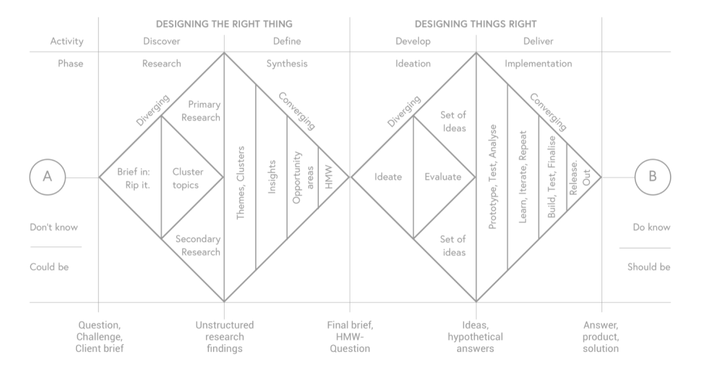
When I started the project, as always, I used Dan Nessler’s Design Thinking Double Diamond to break out the whole process into Discover, Define, Develop, and Deliver phases.
The primary challenge was to simplify a complicated process while also maintaining regulatory compliance and robust security measures.
Additional challenges included integrating with legacy systems and accommodating the needs of diverse user groups.
We conducted a thorough business analysis to determine the economic viability and impact of various proposed UX changes. It was concluded that a revamped UX would not only improve customer satisfaction but also significantly impact conversion rates, thereby increasing revenue.
An in-depth analysis of competitors revealed gaps and opportunities. While some banks offered mortgage calculators or pre-approval forms, none provided an end-to-end digital experience that combined ease-of-use with comprehensive features.
The primary goal is to revamp the mortgage application process at our bank, focusing on user experience to reduce the time and complexities involved. By doing so, we aim to increase customer satisfaction, improve conversion rates, and lower drop-off rates.
We first conducted interviews with internal stakeholders, including loan officers, customer service reps, and management, to understand the business objectives, specific KPIs, and what they perceive as the main challenges in the mortgage application process.
An initial survey was sent out to users who had either successfully completed or dropped off from the mortgage application process. The survey was followed by in-depth interviews with selected users to further understand their needs, pain points, and frustrations.
We conducted a comprehensive review of how competitors and other financial institutions are tackling mortgage applications to identify best practices and innovative solutions.
Collected data was synthesized using affinity mapping techniques to group similar challenges and identify overarching themes.
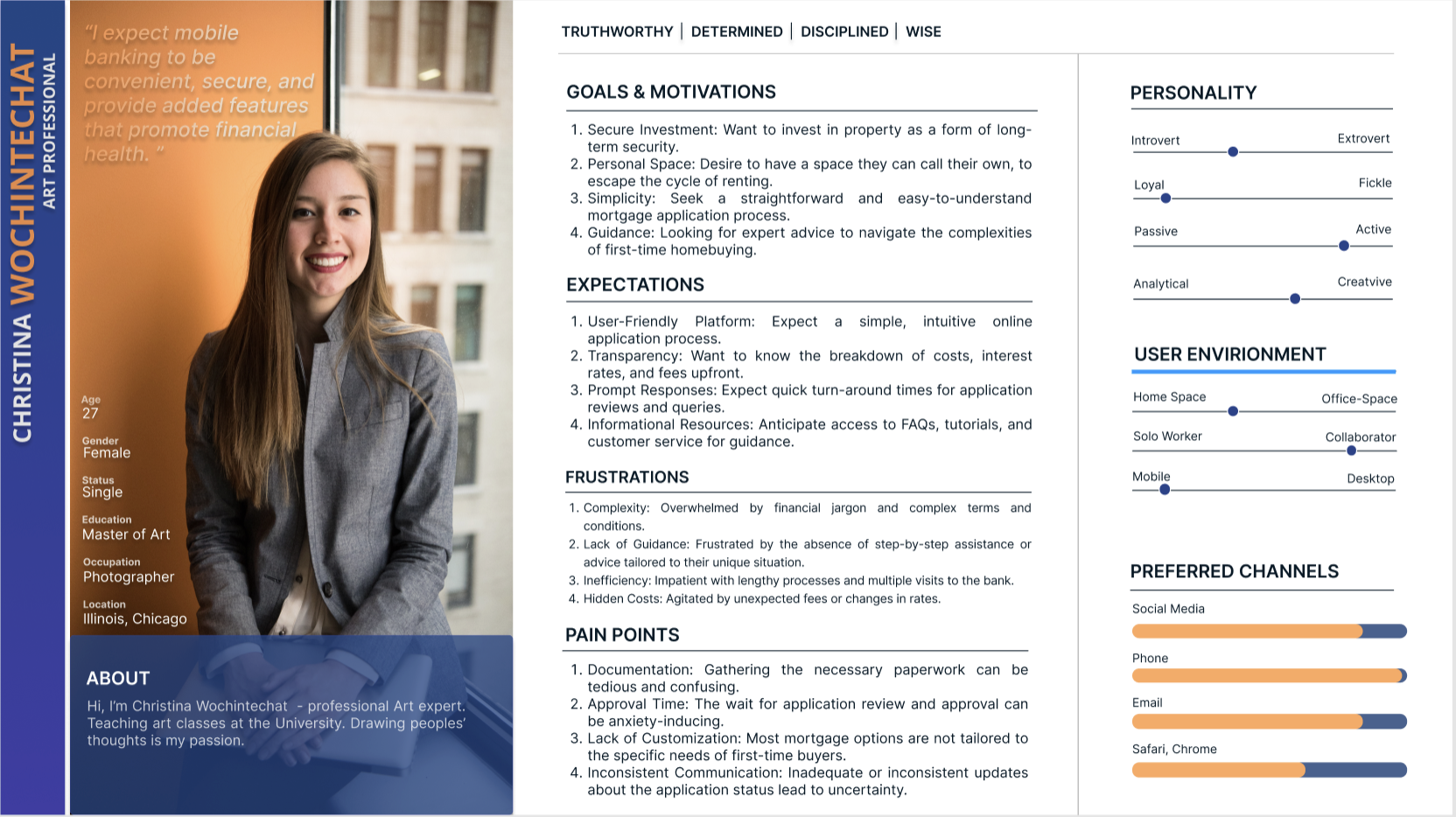
Based on the synthesis, we developed user personas representing typical mortgage applicants, categorizing them by needs, behaviors, and pain points.
The research pointed to several key pain points:
Opportunities for improvement were identified in the areas of user interface, real-time assistance, and step-by-step guidance.
User Interviews: Conducted 15 interviews with users who had recently applied for mortgages, focusing on their challenges and needs.
Focus Groups: Assembled two focus groups, one consisting of applicants who successfully completed the process and another of those who abandoned it. The goal was to gain deeper insights into user experiences and expectations.
Surveys: An online survey was designed and sent out to 200 past applicants to gauge the most pressing issues.
Analytics Review: Analyzed existing analytics data to identify at what stages users most commonly drop off during the application process.
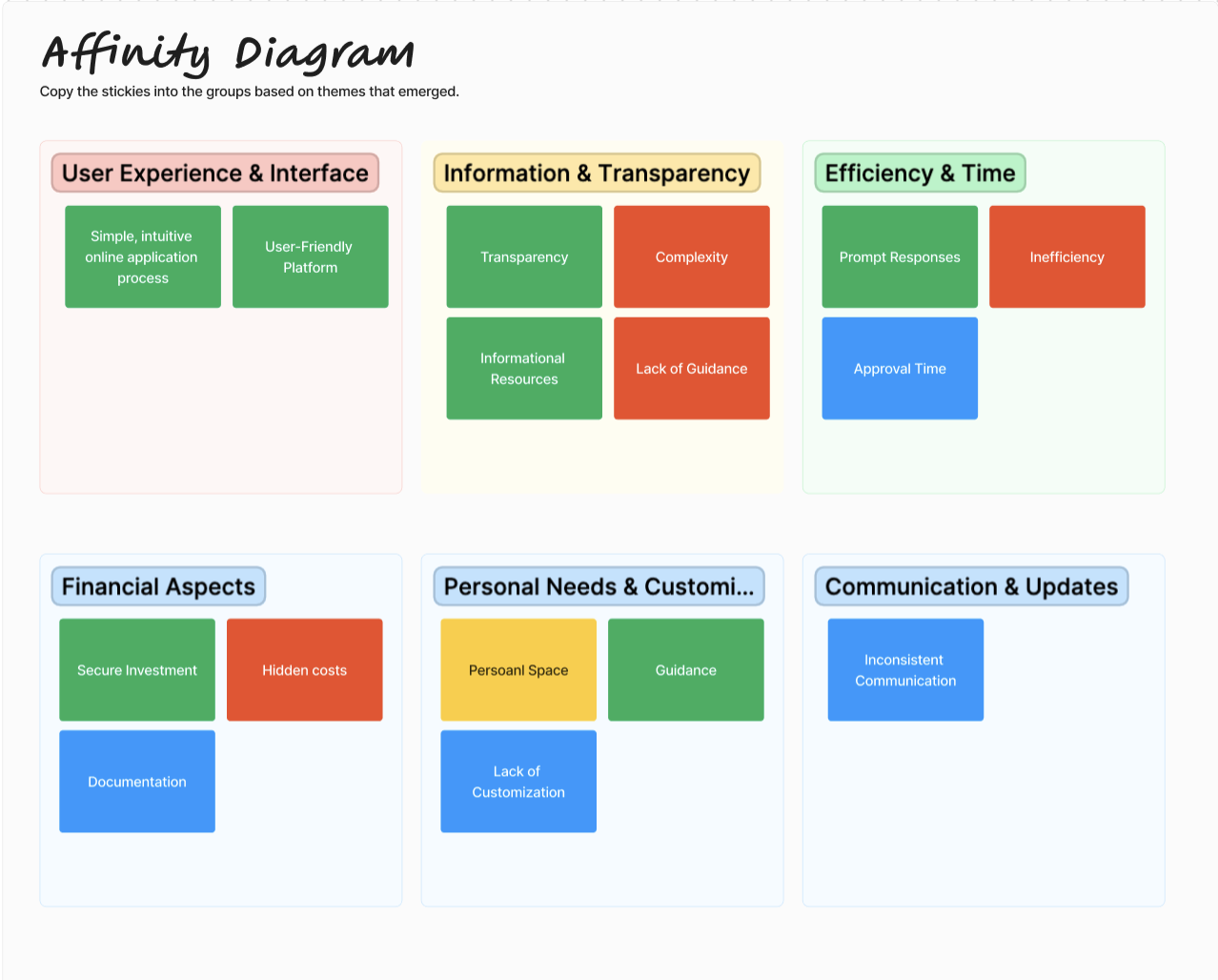
After I collected some rich data from the users, I started to create an Affinity map to get a clearer picture and find out common problems and pain points. I break down into two main categories: User Experience and Interface / Information and transparency / Efficiency and time / Financial Aspects / Personal Needs and customization / Communication and updates.
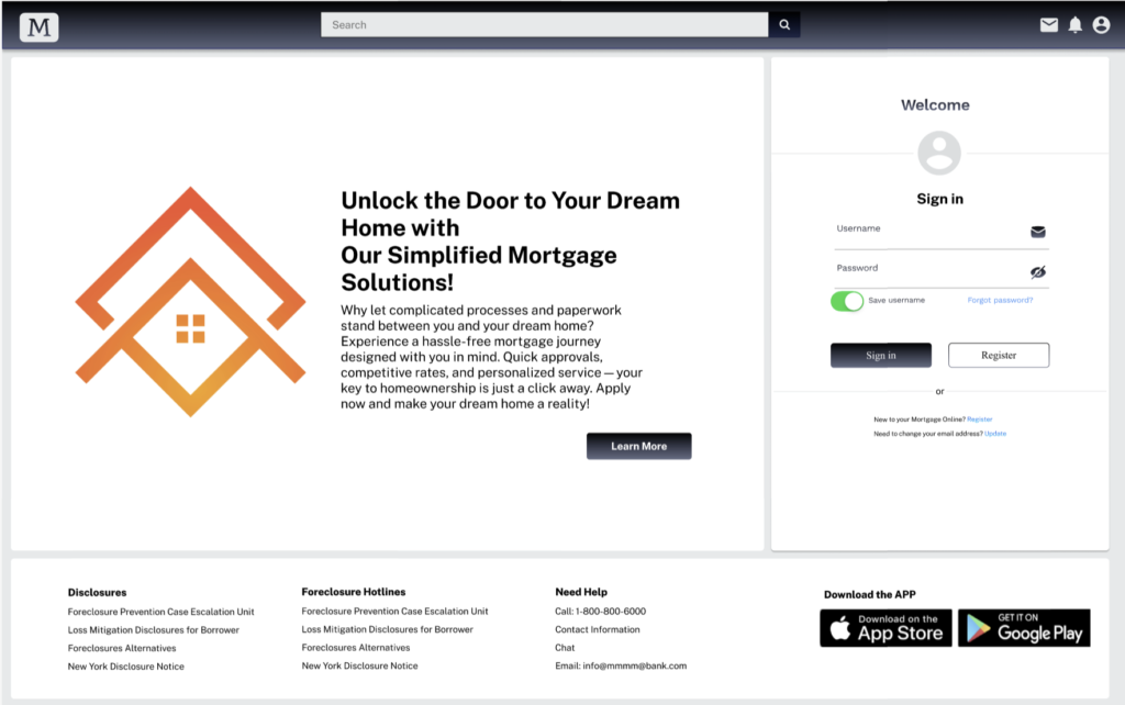
To simplify and accelerate the mortgage loan application process by providing a single-page form that eliminates the need for navigating through multiple pages or clicks.
To execute this, the single-page form should be carefully designed to include:
By allowing users to apply for a mortgage loan via a single-page form, you’re not just making the process faster—you’re also making it more user-friendly, which can have a significant impact on your business metrics in the long run.
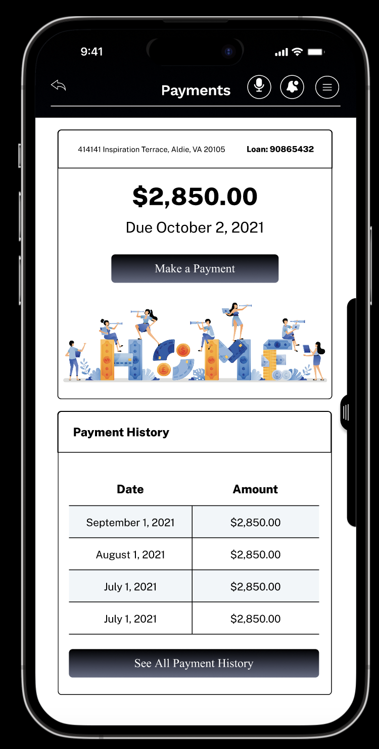
After collected positive feedbacks from my mid-fi prototypes, I started to work on the interface design and improved the visual elements. Created Hi-Fi Map